The Mexican Mural Movement

The Mexican Mural Movement was initially used to educate the Mexican people after the Revolution (Bravo). As the saying goes, “A picture is worth 1000 words”, the murals were used to educate the people who could not read or learn from standard textbooks. Many pieces were based on old heroes or important individuals in the Mexican culture and served as what could be called a visual history textbook (Bravo).

Two very influential artists of the time are David Siquieros and Jose Clemente Orozco. Both of these artist were born in Mexico, and practiced their art there. Jose Clemente lived from 1883-1949 and passed away at his home in Mexico. He did not start painting until 1909, when he switched from sculpting. He is knows as one of the most influential Mexican artists of this time period (Hood Museum). David Siquieros lived from 1896-1974 in Mexico. He had a strong political belief and was also in many of the Mexican wars of the time. It is very neat to see an artist that has such a different back ground than most. He was very vocal in political and labor reform during the time also (David). I will share a few pieces from these two artists that represent the time period well.

MURALISMOROZCO

 “The Departure of Quetzalcoatl” Jose Clemente Orozco, 1932-34, Mexico

“In every painting, as in any other work of art, there is always an IDEA, never a STORY ” – Jose Clemente Orozco

This piece shows the god Quetzalcoatl. I enjoy this piece because when I look at it, there are so many things that come to mind that I cannot even begin to formulate a story for what is happening. What I can do, is think of hundreds of ideas on what the possibilities are. The piece is very clear, and the colorings are very contrasting, making it look very busy. The god looks to have a look of fear, or evil in his eyes. The skeletons seem to be rioting and possibly screaming at the god. I think that this image is representing the layers of their religion and possibly some sort of Hell. I enjoy this piece, and with its very concise lines and figures it was very well though out by the artist, but very thought provoking for the viewer.

Paisaje-montanas

“Paisaje Mantanas” David Siqueiros, 1968, Mexico

 This piece by Siqueiros is very abstract, and difficult for me to tell exactly what he is trying to portray. It looks almost like an upside down volcano. The colors give a fiery and hot look to an otherwise bland color choice. After the piece is looked at for a while, many other shapes can be made out of it and it really leaves it up to the viewer to decide what he or she is seeing. I like this piece because it shows a completely different side of the artist than the piece below. Maybe it represents a volcano that was in Mexican history? Possibly a dragon from myths? there are so many possibilities.

Vista-aerea

“Vista Aerea” David Siqueiros, 1968, Mexico

This piece is much clearer and straight forward. There is a small city nestled into the mountains and it reminds me of Machu Picchu. Siqueiros used much straighter lines, and calmer colors overall to create a wonderful landscape. A piece like this could be referring to the Mexican history, and possible an Aztec or Incan city. Siqueiros was one of the first artist to use acrylic paint (David). The use of acrylic paints made the colors more vibrant, and I think they give the art more depth.

Overall I feel as though these two artists, and their artwork, do an amazing job of creating the mural movement of the time. Each picture is very rich, and full of many interpretations that would make much more sense to someone of the culture. Each artist was using leading technology and ideas for the time periods and together they make new movement. I enjoy this style of art because it is still used today and it is very easy to see the beauty and appreciate it, while not giving the viewers all of the answers to the mystery.

Bravo, Doris. “Khan Academy.” Khan Academy. Web. 23 Apr. 2015. https://www.khanacademy.org/humanities/art-1010/art-between-wars/latin-american-modernism1/a/mexican-muralism-los-tres-grandes-david-alfaro-siqueiros-diego-rivera-and-jos-clemente-orozco

“David Alfaro Siqueiros.” David Alfaro Siqueiros. Web. 23 Apr. 2015. http://www.adanigallery.com/Siqueiros/main.html

“Hood Museum of Art.” About the Artist: José Clemente Orozco (1883-1949). Web. 23 Apr. 2015.http://hoodmuseum.dartmouth.edu/collections/overview/americas/mesoamerica/murals/orozco.html

Freedom of Expression in the Streets

Street art during the Post Modern Era really got popular and it gave artists a way to spread their art to public viewers very easily. A lot of the art is not the typical fine arts, but it has purpose behind each piece that the artist wants to spread to all of the viewers. Some of the biggest street artists are Kurt Wenner and Jean Michel Basquiat.

Kurt Wenner is the artist who created the pieces below. I chose these three pieces because they show how street art turned into commercials for very large companies. These pieces are also unique due to their incredible ability to have a 3-D look. Kurt Wenner worked mainly between Italy and the United States where he worked with other artists to make street art popular. He helped start festivals in the 1980’s that would bring artists from all around, to show off their works. In 1982 Wenner made 3-D pavement art very popular. He uses it to make the flat, 2-D art look realistic. (Wenner)

Smoothie                                                              “Smoothie” Kurt Wenner, Boston, Massachusetts

This piece of art by Kurt Wenner was done as an ad for Dunkin Donuts. There are many components to this piece, including fruits, flowers, and the main attraction in the middle. He does an excellent job making it look realistic, and the colors go together very nicely.

LeBron_James                                                                        “Lebron James” Kurt Wenner, Shanghai, China

This piece was done in Shanghai China for a Nike Commercial. I find it very cool because it brings a very American athlete to another country through an ad, and you can see the viewers are all amazed. The artwork matches to sidewalk very well, he made the brick line up and created an amazing backdrop for the painted poster. Once again this piece of art shows how diverse it really is.

Honda_Formula_I

“Honda Formula 1” Kurt Wenner, Jakarta, Indonesia

Kurt Wenner worked with the Honda Formula 1 team to show off their car in Jakarta. I am shocked at how well it turned out, and how the proportions all look correct. I do not have a real favorite from any of his galleries I find them all very good in different ways. He can take his talent all over the world, and it is recognized by the biggest companies in the world to advertise their product. That is a huge change from the beginning of street art when many people looked at it as not real art.

Jean-Michel Basquiat had a short lived career (life) but he made a large impact while he was working. He lived between 1960-1988 in Brooklyn, New York and dies of a drug overdose. (Jean-Michel). He really emphasized the racial split between White’s and African American’s. His work is so different from Kurt Wenner’s that I though it would should how contrasting the street art really was during the same time periods. In the early 1980’s Basquiat was convinced to start putting his street art onto other mediums, such as canvas. The chosen pieces are on canvas and not the streets, but they are excellent examples of his style of work.

PEZ

“Pez Dispenser” Jean Michel Basquiat, 1984, New York

This piece of art named Pez Dispenser reminds me of a toy candy machine, that in this picture is painted with dark colors, and looks dead. I find this very intriguing because he did not make it pretty in any way, and I am not sure what exactly he is trying to portray. It can be taken so many ways and I wonder if he painted the dinosaur black for a reason? There are a lot of unanswered questions with this one.

SELF PORTRAIT

“Self Portrait” Jean Michel Basquiat, 1984, New York

 This is a piece that Basquiat made, and titled Self Portrait. It is not a very nice piece, and it shows a strange mouth. He died of a drug overdose and I wonder if he also had some self image and depression issues as well. His whole portrait has strange traits such as a black throat with a brown body. I think there is a lot to be said about this image and his view of himself. I like this piece, but it seems quite depressing (Exhibitions).

jean-michel-basquiat-dos-cabezas-1982_i-G-66-6625-FVIE100Z

“Dos Cabezas” Jean Michel Basquiat, 1982, New York

This piece seems to depict a dirty, grungy person on the left, and maybe an eccentric person on the right. He is showing two very different people in one piece. He may be showing the split in New York, but I do not understand why the title is in Spanish. This piece also leaves many unanswered.

I think it is important to see who different the street art can be. Kurt Wenner was hired to create beautiful pieces of art- often commercials. In his form the viewer needs to know exactly what he or she is looking at. He going into each piece with a plan and it is perfectly executed. The art that Basquiat creates is very open ended. There is a lot left to answer and it really makes the viewers think about what they have seen. Even with this new style of street art, there can be so many different forms of it in the same location. I like all of these pieces and I think that they will be enjoyed by a broad range of people.

“Exhibitions: Basquiat.” Brooklyn Museum: Basquiat. Web. 14 Apr. 2015. . http://www.brooklynmuseum.org/exhibitions/basquiat/

“Jean-Michel Basquiat.” Jean-Michel Basquiat. Web. 14 Apr. 2015. . http://basquiat.com

Wenner, Kurt. “About the Artist |.” Web. 14 Apr. 2015. https://kurtwenner.com/blog/about/

The Great Depression’s Effect on Early Modern Art

DEPRESSION “Unhealthy Lifestyle”-Dorothea Lange, California, Mid-1930’s

  The Great Depression was a truly awful time that spanned from 1929-1939. The economy was at an all time low and many american families were poor and in bad shape. The art during this time is mainly photographs that depicted the hardships and reality of the era. Two main photographers of the time are Dorothea Lange and Margaret Bourke-White. I think it is very important to look at these pieces seriously, as we are not in the best economic shape as a country right now, and this is what we need to learn from. So much emotion and reality can be pulled from every single picture. This boy is said to be sick and roaming around a mess of broken and dirty items. The families did not have anything that was new and they could not afford anything. (The History Place)

migrantmother1

“Migrant Mother”- Dorothea Lange, California, 1936

  I can see this photo as being on the cover or a newspaper or magazine that was covering the Great Depression. A mother is holding her children with a complete look of  hopelessness. I think that the picture shows emotions that a painting or other art form would never be able to capture. Dorothea had a long career that led her all around the country and working with all different types of jobs (The Collection). I think the despair that is photo shows, gives a great understanding of how times were tough. These families were farmers and they all had nothing to fall back on when the times got very hard, so they were forced to go without.

at-the-time-of-the-louisville-flood

“At the Time of the Louisville Flood”- Margaret Bourke White, United States, 1937

  This photo sums up a completely different aspect of the time period. As the Great Depression was already taking its toll on everyday lives, there was another issue that was tearing America apart. That was the split between the races. This photo shows a very happy, smiling, wealthy white family on a billboard. The “American Way”, was not very American for many African-American families. Not only did they have to try and get through the hard economic times, but they also had to try and make it past all of the struggles that they had to deal with due to their skin color. This photo shows the real split our country had, even for many years to come.

Overall I really enjoy photography. These photos were really used for a journalistic point of view, but looking back we can see so much history from them. Unlike many other forms of art, I do not find these enjoyable in the same ways, but I find them very interesting and far more important than a piece of happy, make-believe art. It is shocking as a viewer to see a country that we know today, struggling so much in its past. It is a great reminder to what can always happen, and why it is important to as a whole. These two photographers did an excellent job conveying very powerful messages in a new form of art.

“THE COLLECTION.” MoMA.org. Web. 3 Apr. 2015. http://www.moma.org/collection/artist.php?artist_id=3373

“The History Place – Dorothea Lange Photo Gallery: Migrant Farm Families.” The History Place – Dorothea Lange Photo Gallery: Migrant Farm Families. Web. 3 Apr. 2015. http://www.historyplace.com/unitedstates/lange/

Impressionism in Romantic Era Art

I personally do not mind the Impressionist style of art. Although it is not my favorite, its falls right in between as bearable to look at. I think that the loose brush strokes and dots of color do add effect to the artworks, but at the same time is pulls away some of the clarity and depth from the painting.

CLAUDE

800px-Sandro_Botticelli_-_The_Adoration_of_the_Magi_-_Google_Art_Project-300x199

Impression Sunrise- Claude Monet, 1873, France                       Adoration of Magi- Sandro Boticcelli, 1478-82, Florence

The piece of art Impression Sunrise by Claude Monet is from the Impressionism era, while Adoration of Magi by Sandro Boticcelli, is from the Italian Renaissance. Both of these pieces do an excellent job of describing their eras so by comparing the two we can get a feel for what was changing. I think that the major difference that stands out is how the lines change. The Impressionist piece is not near as linear and neat as the Adoration of Magi is. The Impressionist era also used different colors for the shadows and contrasting colors to really draw the viewers in (Samu). The Adoration of Magi has a color scheme that stays brightly colored and an almost perfect look. The sun in the Impression Sunrise really shows how the artist would give a bright The idea of the Impression Sunrise was not the make it look so perfect and similar. Claude was one of the first Impressionist artists so his style was very influential for the artists to then took after him. It looks like a harbor with water that is not perfectly flat, and the shadows of the water have shades of blue, grey, and tan (Claude). I like how the Impressionist piece allows the artist to show the reality of a hazy harbor, but at the same time I really like how linear and color coordinated the art was during the Italian Renaissance. I think that Impressionism brings forward many traits that are still used today to show a setting that is imperfect and busy like a harbor. Looking at this piece of art reminds me of a more modern piece that I would see in everyday people’s homes now.

BLUE SUNSET

Blue Sunset – Leonid Afremov, Boca Raton, FL, 2015

This piece of art is an oil painting on canvas. The artist just made and posted it for sale, and I think it does an excellent job of showing some similarities to the painting Impression Sunrise. The loose brush strokes are very visible to the viewer, and the colors are also very contrasting. This piece does have more life to it with the color choice, but then again that could also just be how the artist wanted the viewer to see it. I think that Impressionism can still be seen in many of todays works and this is a great example of how it is used.

“Claude Monet’s Impression Sunrise.” Claude Monet’s Impression Sunrise. Web. 24 Mar. 2015. http://www.webexhibits.org/colorart/monet.html

Samu, Margaret. “Heilbrunn Timeline of Art History.” Impressionism: Art and Modernity. Web. 23 Mar. 2015. http://www.metmuseum.org/toah/hd/imml/hd_imml.htm

The Middle Class’s Power in Art Throughout the Classical Era

The middle class was growing during the Classical Era. Many values shifted, and the way of life also changed greatly. The middle class was wanting more opportunity in life and wanted to feel as though they were important also. Art was a way to show wealth and power so by taking part in the arts, it gave them the feeling. The middle class did not have the wealth that the upper class did, so new styles of arts became common. The French Revolution happened and the middle class had grown stronger with a sense of pride.

CORN

Cornelia Pointing to Her Children as Treasures, Angelica Kauffmann,1785

This painting shows family value and a sense of community. The art is not of gods, or landscapes now, but of a middle class family. The tall lady looks to be dressed more like an upper class citizen while the rest look slightly lower. This piece really brings out a change in time. Kauffmann was a Neoclassical artist, and the concept of moral value can be easily seen. I personally like this piece because there is a lot of emotion and dialogue that can be seen, but it is not certain was is actually being said. I also enjoy that it looks to be a normal family and not a hero or a god. The location of where the art was made is unknown, but based on the time period it was most likely in Great Britain. (Khan Academy)

NAPOLEON

Napoleon in His Study, Jacques Louis David, 1812, France

This is a very interesting piece of art by Jacques Louis David that portrays Napoleon in his study. Napoleon did a lot for structuring the middle class. Although he was very powerful and an emperor, he built education systems and a strong political structure (The Emperor). This piece of art shows wealth, knowledge, and power very strongly but its the message behind all of that which defines the middle class’s power. I really enjoy this piece because Napoleon was so powerful. He used his power to help others and created such a difference during and after the French Revolution which this piece portrays. His surroundings have scrolls, a nice clock, and many other items that push toward the idea of science, education and with that comes the power of the middle class.

The 40th Symphony was written by Wolfgang Amadeus Mozart in 1788, in Germany. The music was very impressive, but still simpler than the previous era. It was elegant enough for everyone to listen to and enjoy. Mozart even grew up as a middle class citizen and made his way to being a highly regarded composer (Wolfgang). Mozart also worked with other accomplished composers such as Haydn and Beethoven to create schools and education systems for the middle class. This allowed people to become educated and therefore gain power and knowledge about the arts. The music is up beat and easy to listen to unlike some of the more complex musical styles of the time. I really enjoy it for this reason, and I can see how a symphony would allow all classes of people to enjoy it and feel empowered unlike the elite styles of the baroque era.

Overall these pieces show values that tie the middle class to having power in the Classical Era. The secular, moral, viewpoints can be seen and this is just how they felt. The music is lively and very refreshing for any class of person to listen to. Each one of these pieces gives a unique perspective into how the middle class grew in the Classical Era.

“Khan Academy.” Khan Academy. Web. 6 Mar. 2015. <https://www.khanacademy.org/humanities/monarchy-enlightenment/neo-classicism/a/kauffmann-cornelia-presenting-her-children-as-her-treasures>.

“The Emperor Napoleon in His Study at the Tuileries.” Explore This Work. Web. 6 Mar. 2015. <http://www.nga.gov/content/ngaweb/Collection/highlights/highlight46114.html>.

“Wolfgang Amadeus Mozart | Biography – Austrian Composer.” Encyclopedia Britannica Online. Encyclopedia Britannica. Web. 6 Mar. 2015. <http://www.britannica.com/EBchecked/topic/395455/Wolfgang-Amadeus-Mozart>

The Council of Trent and Counter- Reformation in the Baroque Era

velazquez-christ

“Christ on the Cross” Diego Velazquez, 1632

 The piece “Christ on the Cross” by Diego Velazquez shows so many different influences from the Baroque era. The exact location where the piece was painted is unknown, but Velazquez was born in Seville, Spain and was part of the Spanish Baroque era. It would be safe to guess that he was in Spain when he painted this piece (Diego). Some of the very obvious traits is the tenebrism and coloring, and the religious aspect that came back into the art.

The Council of Trent was a meeting that many religious and important figures held to discuss the reformation and how they could combat it. The reformation pulled religious views out of art, and in doing so, out of the center of people’s lives. The Catholics and other strong religions wanted to see Christ and other figures back in art, so they started the idea of once again incorporating religious views (Mayor). This painting really brings many of the defining aspects of the Baroque era and incorporate them into one painting. The lighting, and religious styles are very strong and show the view of the time period.

I really like this piece, not for the religion aspect, but for the drastic difference from the Renaissance times. The light and dark color contrast of tenebrism really gives this painting the depth and attention to Christ that the artist wanted to emphasize.  Velazquez really used the ideas of anti-mannerism and focused strictly to religion in an attempt to spread the style and word of religion once again. The merchant class was finally able to own and admire art during the Baroque era so it was a quick way to spread ideas. Personally, I enjoyed the landscapes and styles of paintings in the Renaissance over the religious only, and more depressing (in my opinion) religious and mythical art.

800px-Sandro_Botticelli_-_The_Adoration_of_the_Magi_-_Google_Art_Project-300x199

“Adoration of Magi” Sandro Botticelli, Florence, 1478-82

I would like to compare this piece of art to “The Adoration of Magi” by Botticelli. Botticelli was an artist during the Italian Renaissance when mannerism and humanism was taking place. This is exactly what the Catholic Church did not like. The cited article by Mayor explains in great detail the basics behind the movements, but an easy way to compare is to simply look at the art. The Baroque art is very focused on Christ and his characteristics, while this Italian Renaissance art is focused on the landscapes, colors, the beauty of the clothing, and the small baby is in the center, but very small. I personally like the Renaissance work more, because it is more representative of day to day live while the Baroque art is focused more on the religious and sacred ideas of the time. I would say that art today has definitely falling back to focusing on humans and ourselves rather than religion for the most part.

“Diego Velazquez (1599–1660).” Velazquez: Spanish Baroque Painter. Encyclopedia of Old Masters Painters. Web. 22 Feb. 2015. <http://www.visual-arts-cork.com/old-masters/velazquez.htm>.

Mayor, Hyatt. “The Art Of The Counter Reformation.” 1-5. The Metropolitan Museum of Art. Web. 22 Feb. 2015. <http://www.google.com/url?sa=t&rct=j&q=&esrc=s&source=web&cd=8&ved=0CFMQFjAH&url=http://www.metmuseum.org/pubs/bulletins/1/pdf/3257265.pdf.bannered.pdf&ei=7UPqVO2fHc7qoASy5ILYDg&usg=AFQjCNFEB9j_uCLmSseS9BYylMaXJqylkQ&bvm=bv.86475890,d.cGU>.

Botticelli’s Incorporation Of Humanism In the Renaissance

Humanism was a change in the arts that focused greatly on the individual. In the past religion was the most important part of life and it was obvious when looking at the art. The gods or important figures were always much prettier, larger, or just more aesthetically pleasing in general. The new practice of humanism brought the importance back to the the individual. This let the artist choose how large, or beautiful he wanted to make anyone there did not have to be a difference. Humanism can be seen in art even today, as so much of the world revolves around beauty and the focus on one’s self.

800px-Sandro_Botticelli_-_The_Adoration_of_the_Magi_-_Google_Art_Project-300x199  
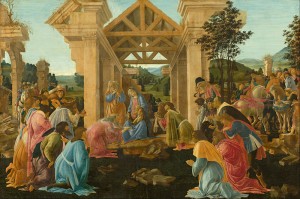
“The Adoration of the Magi” -Sandro Botticelli

Sandro Botticelli was born in 1445 and died in 1510. He lived in Italy, and was supported for some time by the Medici family. They were very strong supporters in the Italian Renaissance and Botticelli was able to flourish with their support. Boticelli did a lot of religious paintings even though he was not a very religious person. Religious art was one of the few ways to make a living as an artist so as humanism came into the picture it let Botticelli open up into broader art (Lightbrown). The painting The Adoration of Magi was made between 1478-1482 in Florence, Italy.

An excellent example of humanism can be seen in Botticelli’s piece “The Adoration of the Magi”. There was use of linear perspective- so the lines and shapes all get definition and line up well. The people in the painting all share common sizes and proportionality’s showing that none of them are more important. The painting does use the linear perspective to draw the eyes in toward the middle where there is a small child or god that the people are praising. Something unique about that is the child is very small and more detail is not added. The colors on the peoples headdresses and the harnesses on the horses seem to have more color than the baby does. That is humanism putting more emphasis on the beauty of the individual than on the gods or important figures of the time (AAM). A common way humanism is noticeable in art is the way that artists would change heavenly backgrounds and make them earthly or less godly (Cheney). That was done with this painting also. There are rolling hills and grass instead of clouds and bright white backdrops, these subtle changes completely changed the was people viewed and interpreted the art even if the viewer was not completely aware at the time.

Botticelli did an amazing job of bringing humanism into his art, especially this piece. I like how he used some vibrant colors that stand out against the light sky and green hills. The trusses and linear perspective really draws my eye as the math behind the art comes to life. Botticelli painted many famous and great pieces, but I feel as though The Adoration of Magi brings humanism to real life and shows its components perfectly.

Below is another image from the contents of the class that also gives a great insight into how humanism can be seen.

madonna-zoom-raphael-300x225                                                                       
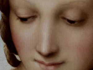
“Madonna of the Meadow” -Raphael

This piece by Raphael gives an excellent close up example on how the artists focused on beauty during this era. Madonna’s cheeks have color, and her eyes are very defined. In prior years she may not have had so much coloring and depth to her face and body, which would not emphasize the beauty of the person, just the art itself.

Bibliography

“AAM—The Renaissance Connection: Lesson Plans: Humanism in the Renaissance.” AAM—The Renaissance Connection: Lesson Plans: Humanism in the Renaissance. Allentown Art Museum. Web. 12 Feb. 2015. <http://www.renaissanceconnection.org/lesson_social_humanism.html>

Cheney, Dr. Liana. “Italian Renaissance Art: Humanism & Philosophical Background: Neoplatonism, Ficino and Pico.” Italian Renaissance Art: Humanism & Philosophical Background: Neoplatonism, Ficino and Pico. Univeristy of Massachusetts. Web. 12 Feb. 2015. <http://faculty.uml.edu/CulturalStudies/Italian_Renaissance/8_9.htm>.

Lightbrown, Ronald. “Sandro Botticelli | Biography – Italian Painter.” Encyclopedia Britannica Online. Encyclopedia Britannica. Web. 13 Feb. 2015. <http://www.britannica.com/EBchecked/topic/75231/Sandro-Botticelli>.

Introduction

My name is Kenley Scarlett. I am a sophomore studying Mechanical Engineering. I am from Kenai, Alaska. I like to ski, hike, and bike throughout the different seasons and I also enjoy riding motorcycles and my truck. I have not used a blog very much, so this will be a pretty big learning curve for me, but it should be a good class

.IMG_1249

My relationship with art is very distant as I have grown up. I used to play piano and take lessons while I grew up. I wish I still played and I often talk about picking it back up. I really enjoyed it. As for theater and film making, I have not participated in either really. The most I have ever done was Gopro my skiing and motorcycle rides for fun and never edited or played with the film very much. Digital photography interests me a lot, I am not very good but I really enjoy looking at peoples work that are good. It is very impressive what people are able to capture and even the technology behind a dslr is very interesting. I went to Hawaii over break and took a painting class that consisted of people four times my age drinking wine and painting a landscape of the beach. It was a lot of fun. I am anxious to view more art in this class so that I can better understand the different styles.

http://www.lik.com

I walked through one of his galleries and his work was amazing. All printed on metal or glass with a special ink that contains some silver compounds to change the look of the work as the lighting changed.